Milaim Hasanaj
Parkster AB
🅿️ Parkster (2023)
Redesign of Parkster’s Help & Support flow — focused on clarity, taxonomy, and chatbot integration to improve user access to support.
Play prototype
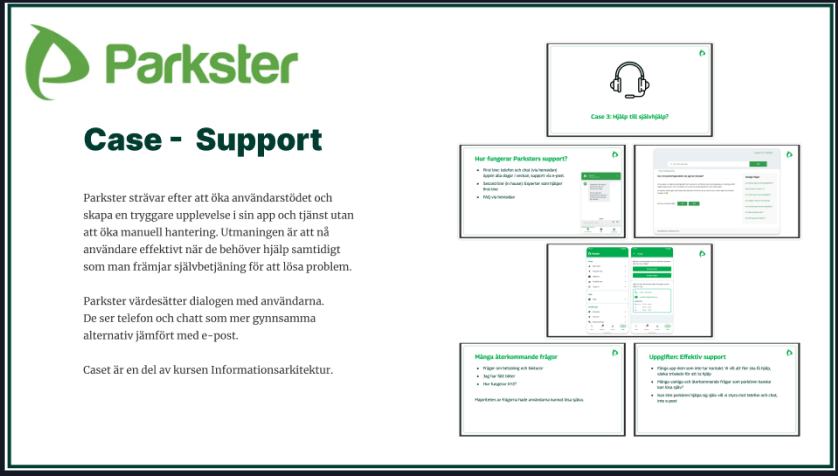
🎯 Project Overview
As part of our Information Architecture course, our team was challenged to improve the Help & Support flow in the Parkster app. The existing support section lacked visibility, was hard to navigate, and often left users unsure of where to find the right help.
Our goal was to redesign the support experience by:
- Improving taxonomy and information hierarchy.
- Introducing a dedicated support entry point.
- Designing an AI-powered chatbot that works seamlessly with live support.
The result: a clearer, faster, and more accessible support flow – helping users resolve issues without frustration.
🔍 Research & Insights
We started by investigating three areas:
- Internal data from Parkster – identifying common support requests.
- User perspectives – understanding pain points and expectations through surveys.
- Competitor analysis – benchmarking EasyPark, Aimo Park, and others to explore best practices.
We found that:
- Users struggled with hidden support functions and unclear pathways.
- Competitors offered better Q&A visibility but often lacked personalization.
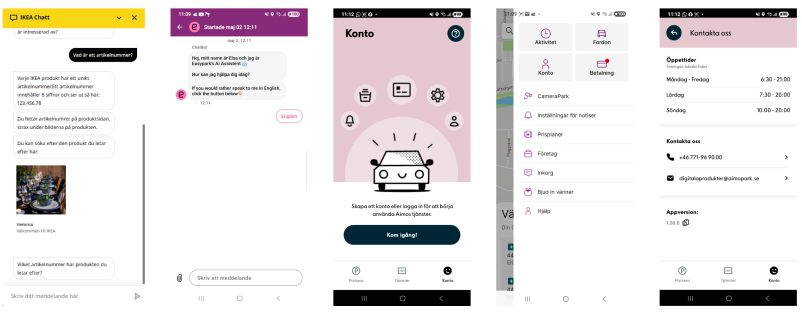
- Inspiration from IKEA and broader UX research showed the importance of chatbots and structured navigation in guiding users.
🎯 Target Audience & Personas
To ground our design, we created two personas representing typical Parkster users:
- Federico – a tech-savvy driver who wants quick, direct help via chat. He represents the “known item seeker” who knows exactly what he’s looking for.
- Ylva – a single mom who values clear guidance and easy-to-follow Q&A content. She represents the “exploratory seeker” who prefers browsing and discovering answers step by step.
These personas helped us balance directness and discoverability in the support flow.

🔍 User Research & Card Sorting
We surveyed 62 Parkster users, mostly aged 26–45. While many used the app weekly, 17% reported issues—such as zone code confusion, long parking sessions, payment confirmations, and app freezing. Surprisingly, only 4% had used the help function.
Users requested a searchable Q&A section, better access to cheaper parking, and easier payment options like Swish.
We also used card sorting to understand how users organize support content and reviewed the app’s current help taxonomy to identify gaps in structure and accessibility.
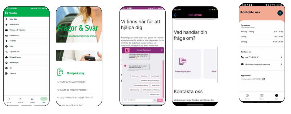
🔍 Competitor Analysis
We analyzed EasyPark and Aimo Park’s support flows to understand industry standards:
- EasyPark emphasized categorized Q&A content but often felt overwhelming.
- Aimo Park offered a cleaner interface, though with limited chatbot functionality.
From this, we concluded that Parkster needed:
- A visible, dedicated support icon.
- Clear taxonomy and categorization for both quick answers and detailed exploration.
- A chatbot that integrates seamlessly with live support, reducing user frustration.
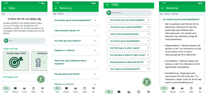
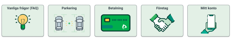
🧭 Taxonomy in Parkster’s Help Section
We restructured Parkster’s support into:
- Main categories & subcategories → for clarity and intuitive navigation.
- Breadcrumbs & labeling → so users always know where they are.
- Q&A articles → written in accessible language, supporting both Federico (direct) and Ylva (exploratory).
This structure increased findability and reduced the risk of users feeling lost.
✅ Findings & Insights
User Pain Points:
- Support felt hidden and hard to access.
- Zone codes, payments, and parking duration caused frequent confusion.
- No in-app Q&A or intuitive self-service options.
- Limited visibility led to low usage of help content.
Proposed Solutions:
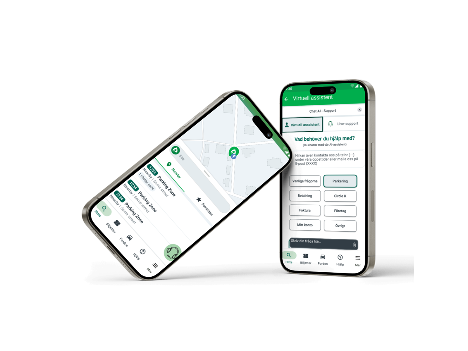
- Add a virtual assistant (chatbot) for 24/7 support.
- Introduce a dedicated support icon in the navigation bar.
- Redesign Q&A as a swipe-based, intuitive flow.
- Use dropdowns and progressive disclosure to reduce clutter.
Challenges Faced:
- Balancing between chatbot, Q&A, and live support.
- Limited team resources and time.
- Translating theoretical IA concepts into practical design.
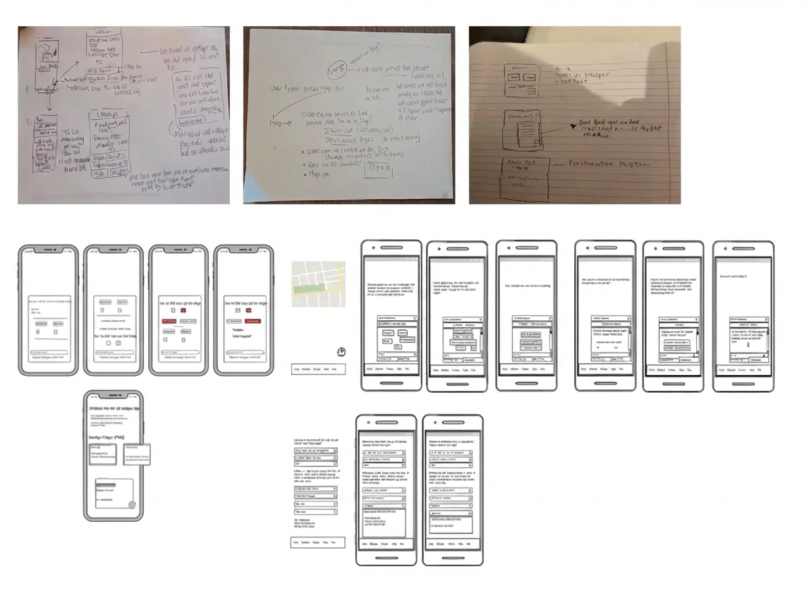
✏️ Ideation & Sketching
We began with brainstorming sessions and rapid paper sketches, allowing us to explore ideas without technical constraints.
- Early lo-fi sketches clarified direction.
- Concepts were iterated into Balsamiq wireframes.
- Team collaboration ensured we stayed aligned with user needs.
This iterative approach gave us confidence before moving into hi-fi prototyping.
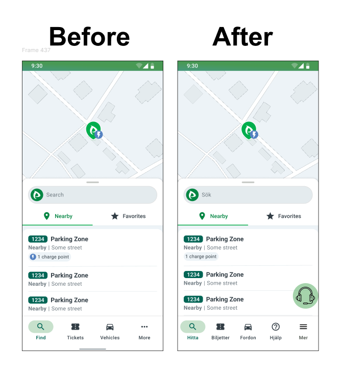
🧩 Wireframe Design & Structure
In our wireframes, we focused on clarity and accessibility:
- Navigation bar integration → Adding a Help icon to make support always visible.
- AI Chatbot integration → Providing step-by-step answers and guided troubleshooting.
- Flexible access → Users can switch between chatbot and live support without losing context.
- Feedback loop → Users receive confirmations and updates, reducing uncertainty.
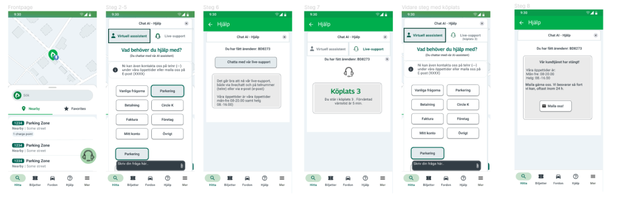
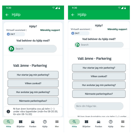
✅ Final Experience
The redesigned flow allowed users to:
- Access support directly via the navigation bar.
- Start with an AI-powered assistant for common issues.
- Switch seamlessly to live support when needed.
- Track progress via a queue system with estimated wait times.
- Receive clear notifications and next steps both inside and outside office hours.
This structure supported both “known item seekers” like Federico and “exploratory seekers” like Ylva – making support more inclusive and user-friendly.
🎓 Reflections & Learnings
Key Achievements
- Successfully introduced a redesigned support flow with AI chatbot integration.
- Positive feedback from testing – users found support easier to access and navigate.
- Delivered wireframes and hi-fi prototypes closely aligned with user needs.
What I Learned
- Even small changes in taxonomy and wording have a big impact on usability.
- Iterating early with low-fidelity sketches saved time and improved collaboration.
- Realized the importance of combining theory (IA concepts) with hands-on prototyping.
Future Directions
- Explore ways to make support even more inclusive and proactive.
- Validate the flow with real Parkster users through usability testing.
- Continue refining chatbot + live support integration for long-term scalability.
Play prototype
Next project Fitfusion