Milaim Hasanaj
Quickbutik
Redesign of Quickbutiks onboarding process.
In a UX project focused on improving the onboarding experience for the Swedish e-commerce platform Quickbutik.
The goal was to improve their onboarding flow — from registration to store launch — with a focus on reducing drop-offs during payment and shipping setup.
Play prototype
🎯 Project Overview
The goal was to improve their onboarding flow — from registration to store launch — with a focus on reducing drop-offs during payment and shipping setup.
This redesign aimed to reduce onboarding drop-offs and increase successful store launches.
🔍 Problem & Insights
Quickbutik had identified two major drop-off points:
- After registration
- During payment & shipping setup
The onboarding flow connects multiple internal systems such as payments, shipping configuration and store setup, which creates additional complexity for new users.
Through competitor analysis and a user survey, I uncovered that users needed:
- Step-by-step clarity
- Real-time feedback
- Easy guidance through complex decisions
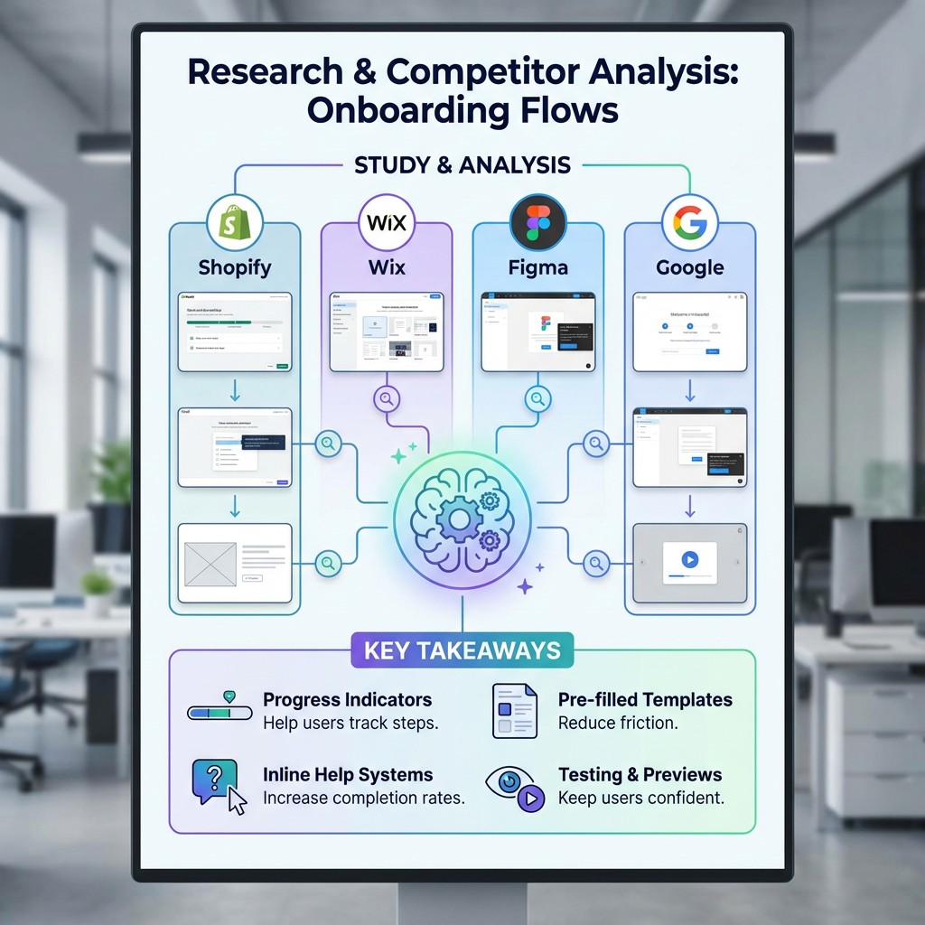
Research & Benchmarking
Research & Competitor Analysis I studied onboarding flows from Shopify, Wix, Figma, and Google to understand best practices. Key takeaways:
- Progress indicators help users track steps
- Pre-filled templates reduce friction
- Inline help systems increase completion rates
- Testing and previews keep users confident
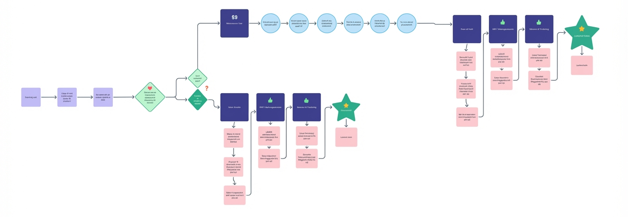
User Flow
Visualizing the New Onboarding JourneyBased on research and feedback, I created a new flow to reduce friction.
It prioritized:
- Clear decision points
- Feedback loops
- Simpler payment & shipping setup
- Key milestones like store launch
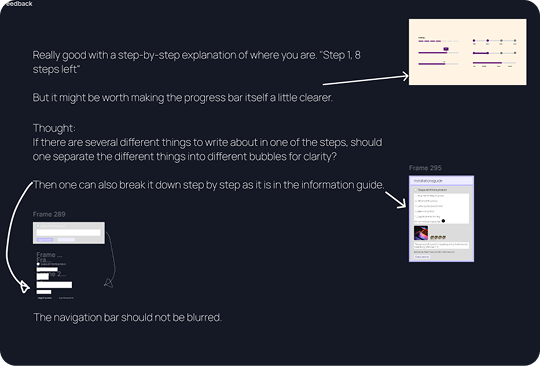
Design Iteration & Feedback
Continuous Improvement Feedback highlighted:
- Progress indicators should be more prominent
- Complex steps needed smaller, digestible chunks
- Navigation should remain visible and not blurred
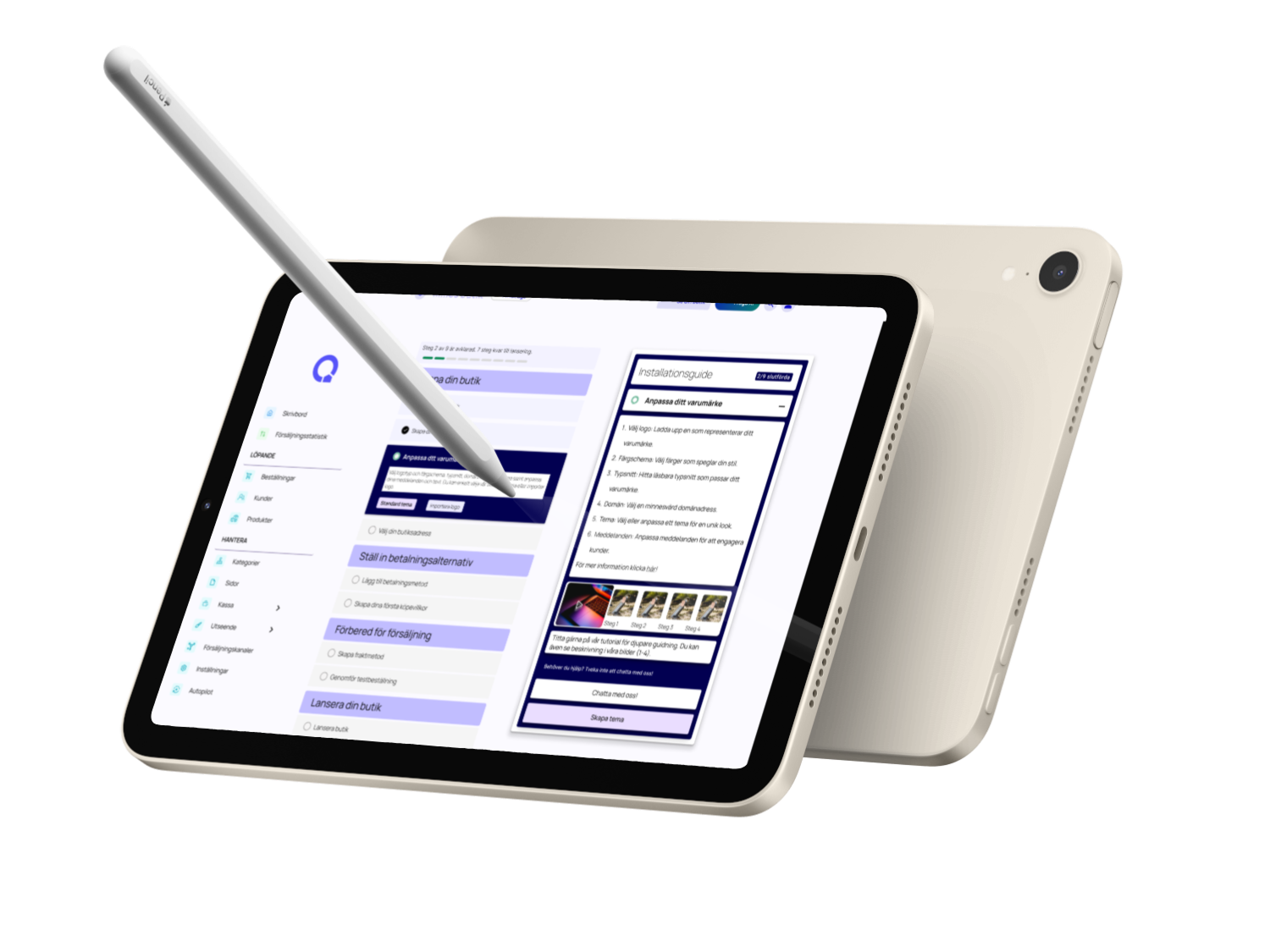
I iterated on the prototype, refining both layout and instructional content.
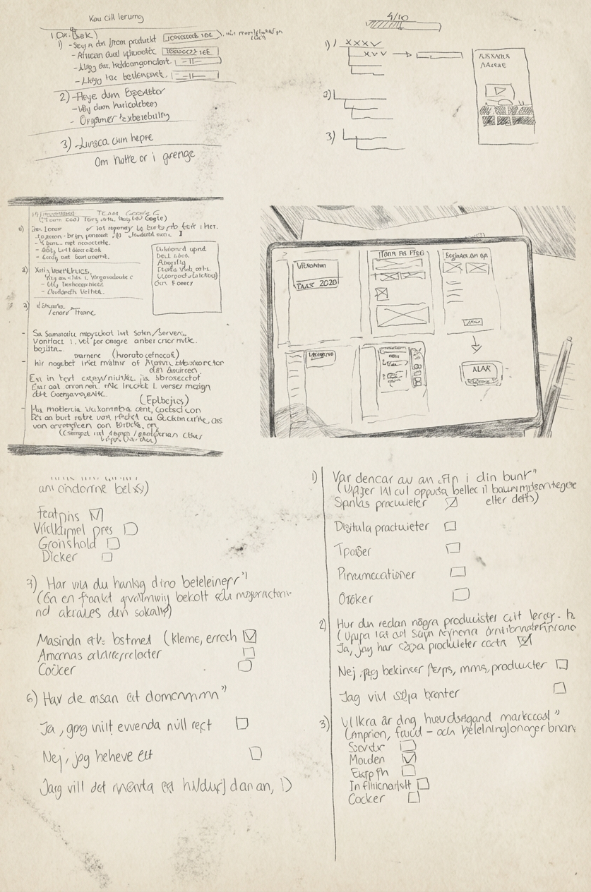
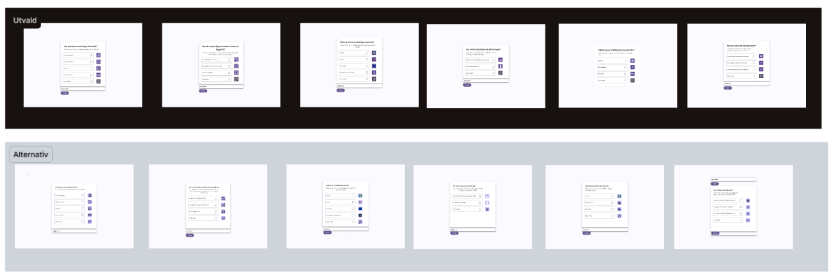
Ideation & Sketching
From Lo-fi to Mid-fi I started with hand-drawn wireframes and digital sketches. Two concepts (A & B) were tested with A/B testing. 👉 Option B, with inline guidance and pop-up tips, won 4/5 votes.
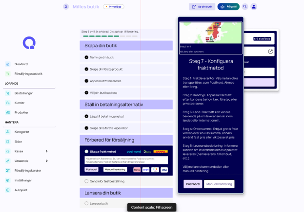
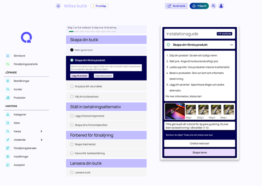
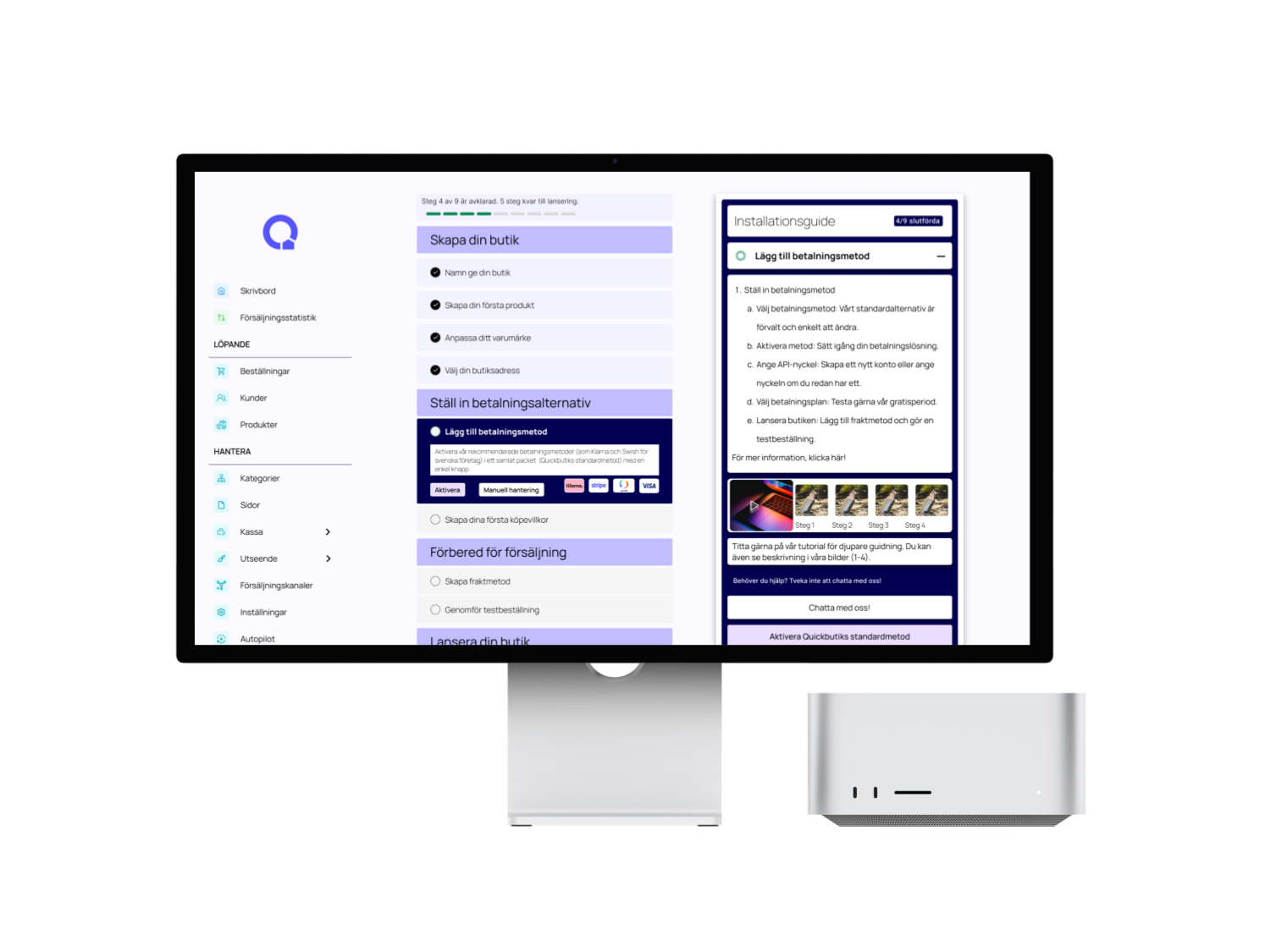
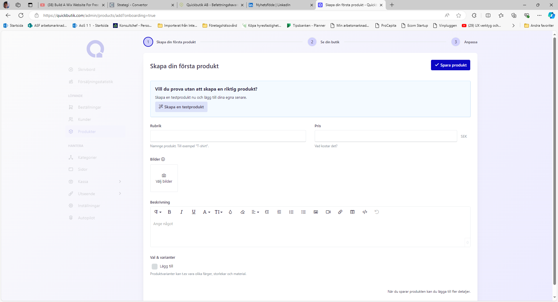
✅ Final Prototype & Features
User Pain Points:
- Support felt hidden and hard to access.
- Zone codes, payments, and parking duration caused frequent confusion.
- No in-app Q&A or intuitive self-service options.
- Limited visibility led to low usage of help content.
Proposed Solutions:
- Add a virtual assistant (chatbot) for 24/7 support.
- Introduce a dedicated support icon in the navigation bar.
- Redesign Q&A as a swipe-based, intuitive flow.
- Use dropdowns and progressive disclosure to reduce clutter.
Challenges Faced:
- Balancing between chatbot, Q&A, and live support.
- Limited team resources and time.
- Translating theoretical IA concepts into practical design.
Learnings & Impact
We began with brainstorming sessions and rapid paper sketches, allowing us to explore ideas without technical constraints.
- Early lo-fi sketches clarified direction.
- Concepts were iterated into Balsamiq wireframes.
- Team collaboration ensured we stayed aligned with user needs.
This iterative approach gave us confidence before moving into hi-fi prototyping.
Play prototype
Next project Read It
Milaim Hasanaj
Quickbutik
Redesign of Quickbutiks onboarding process.
In a UX project focused on improving the onboarding experience for the Swedish e-commerce platform Quickbutik.
The goal was to improve their onboarding flow — from registration to store launch — with a focus on reducing drop-offs during payment and shipping setup.
Play prototype
🎯 Project Overview
The goal was to improve their onboarding flow — from registration to store launch — with a focus on reducing drop-offs during payment and shipping setup.
This redesign aimed to reduce onboarding drop-offs and increase successful store launches.
🔍 Problem & Insights
Quickbutik had identified two major drop-off points:
- After registration
- During payment & shipping setup
The onboarding flow connects multiple internal systems such as payments, shipping configuration and store setup, which creates additional complexity for new users.
Through competitor analysis and a user survey, I uncovered that users needed:
- Step-by-step clarity
- Real-time feedback
- Easy guidance through complex decisions
Research & Benchmarking
Research & Competitor Analysis I studied onboarding flows from Shopify, Wix, Figma, and Google to understand best practices. Key takeaways:
- Progress indicators help users track steps
- Pre-filled templates reduce friction
- Inline help systems increase completion rates
- Testing and previews keep users confident
User Flow
Visualizing the New Onboarding Journey. Based on research and feedback, I created a new flow to reduce friction.
It prioritized:
- Clear decision points
- Feedback loops
- Simpler payment & shipping setup
- Key milestones like store launch
Design Iteration & Feedback
Continuous Improvement
Feedback highlighted:
- Progress indicators should be more prominent
- Complex steps needed smaller, digestible chunks
- Navigation should remain visible and not blurred
I iterated on the prototype, refining both layout and instructional content.
Ideation & Sketching
From Lo-fi to Mid-fi I started with hand-drawn wireframes and digital sketches.Two concepts (A & B) were tested with A/B testing. 👉 Option B, with inline guidance and pop-up tips, won 4/5 votes.
✅ Final Prototype & Features
User Pain Points:
- Support felt hidden and hard to access.
- Zone codes, payments, and parking duration caused frequent confusion.
- No in-app Q&A or intuitive self-service options.
- Limited visibility led to low usage of help content.
Proposed Solutions:
- Add a virtual assistant (chatbot) for 24/7 support.
- Introduce a dedicated support icon in the navigation bar.
- Redesign Q&A as a swipe-based, intuitive flow.
- Use dropdowns and progressive disclosure to reduce clutter.
Challenges Faced:
- Balancing between chatbot, Q&A, and live support.
- Limited team resources and time.
- Translating theoretical IA concepts into practical design.
Learnings & Impact
We began with brainstorming sessions and rapid paper sketches, allowing us to explore ideas without technical constraints.
- Early lo-fi sketches clarified direction.
- Concepts were iterated into Balsamiq wireframes.
- Team collaboration ensured we stayed aligned with user needs.
This iterative approach gave us confidence before moving into hi-fi prototyping.
Play prototype
Next project Read It
Milaim Hasanaj
Quickbutik
Redesign of Quickbutiks onboarding process.
In a UX project focused on improving the onboarding experience for the Swedish e-commerce platform Quickbutik.
The goal was to improve their onboarding flow — from registration to store launch — with a focus on reducing drop-offs during payment and shipping setup.
Play prototype
🎯 Project Overview
The goal was to improve their onboarding flow — from registration to store launch — with a focus on reducing drop-offs during payment and shipping setup.
This redesign aimed to reduce onboarding drop-offs and increase successful store launches.
🔍 Problem & Insights
Quickbutik had identified two major drop-off points:
- After registration
- During payment & shipping setup
The onboarding flow connects multiple internal systems such as payments, shipping configuration and store setup, which creates additional complexity for new users.
Through competitor analysis and a user survey, I uncovered that users needed:
- Step-by-step clarity
- Real-time feedback
- Easy guidance through complex decisions
Research & Benchmarking
Research & Competitor AnalysisI studied onboarding flows from Shopify, Wix, Figma, and Google to understand best practices.
Key takeaways:
- Progress indicators help users track steps
- Pre-filled templates reduce friction
- Inline help systems increase completion rates
- Testing and previews keep users confident
User Flow
Visualizing the New Onboarding JourneyBased on research and feedback, I created a new flow to reduce friction.
It prioritized:
- Clear decision points
- Feedback loops
- Simpler payment & shipping setup
- Key milestones like store launch
Ideation & Sketching
From Lo-fi to Mid-fi I started with hand-drawn wireframes and digital sketches. Two concepts (A & B) were tested with A/B testing. 👉 Option B, with inline guidance and pop-up tips, won 4/5 votes.
Design Iteration & Feedback
Continuous Improvement Feedback highlighted:
- Progress indicators should be more prominent
- Complex steps needed smaller, digestible chunks
- Navigation should remain visible and not blurred
I iterated on the prototype, refining both layout and instructional content.
Final Prototype & Features
User Pain Points:
- Support felt hidden and hard to access.
- Zone codes, payments, and parking duration caused frequent confusion.
- No in-app Q&A or intuitive self-service options.
- Limited visibility led to low usage of help content.
Proposed Solutions:
- Add a virtual assistant (chatbot) for 24/7 support.
- Introduce a dedicated support icon in the navigation bar.
- Redesign Q&A as a swipe-based, intuitive flow.
- Use dropdowns and progressive disclosure to reduce clutter.
Challenges Faced:
- Balancing between chatbot, Q&A, and live support.
- Limited team resources and time.
- Translating theoretical IA concepts into practical design.
Learnings & Impact
We began with brainstorming sessions and rapid paper sketches, allowing us to explore ideas without technical constraints.
- Early lo-fi sketches clarified direction.
- Concepts were iterated into Balsamiq wireframes.
- Team collaboration ensured we stayed aligned with user needs.
This iterative approach gave us confidence before moving into hi-fi prototyping.
Play prototype
Next project Read It