Milaim Hasanaj
🌍 Project Overview – Journey
💪 Fitfusion – Training Made Simple and Motivating
Fitfusion was developed as part of my Interface Design course in 2023. The goal was to design a fitness app that helps busy professionals build consistent workout habits through short, effective sessions, equipment guidance, and motivational features.
Play prototype
🎯 The Challenge
Many professionals aged 30–45 struggle to stay active due to limited time, lack of gym experience, and low energy after work. Existing fitness apps often provide long sessions or complex training plans, which can be overwhelming.
The challenge was to create a simple, motivating, and beginner-friendly fitness app that fits into users’ busy lives.
👥 Target Audience & Persona
Target audience: Busy professionals, 30–45 years old, looking for accessible fitness solutions.
Persona – Mille Brandon, 36, Marketing Manager
- Background: Lives in Malmö, beginner at fitness, feels low energy after work.
- Goals: Start regular training, learn equipment use, integrate short sessions into his schedule.
- Frustrations: Lack of time, stress, no gym experience.
- Needs: Clear guidance, short workouts, motivational rewards, and social engagement.

🔍 Research & Insights
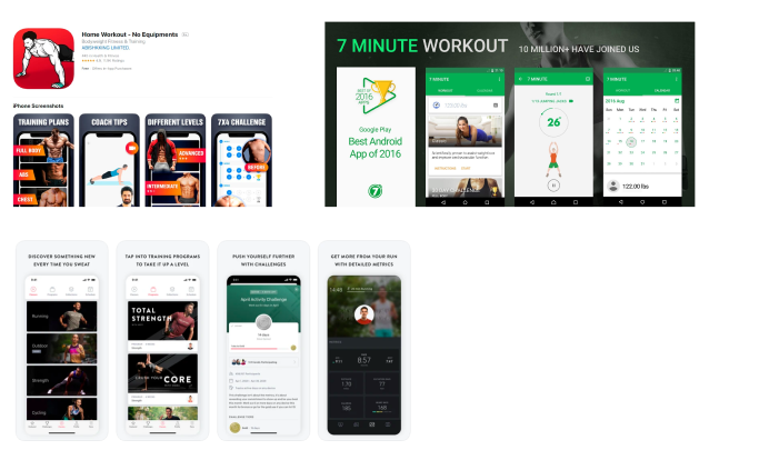
I analyzed popular apps such as Home Workout, Nordic Wellness, and 24Seven, focusing on how they support beginners.
Key findings:
- ⏱ Users struggle with time and consistency
- 🏋️ They need short, guided workouts
- 🎮 Motivation grows through gamified features
- 👥 Social features like inviting friends increase engagement
These insights shaped Fitfusion’s motto:“Training should be simple, fun, and fit into my busy life.”
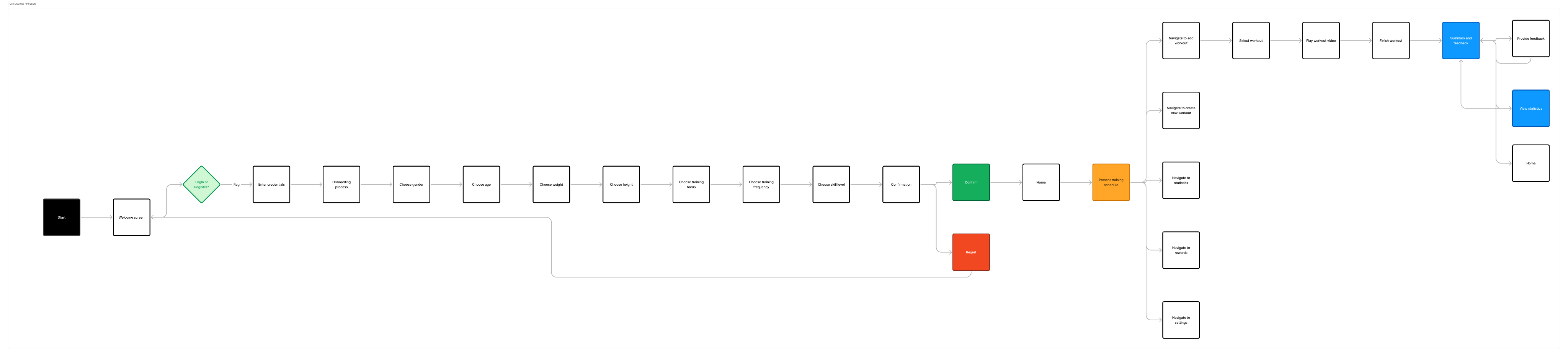
🗺 User flow
To map how users interact with Fitfusion, I designed a User Flow for the onboarding process. The flow shows each step new users go through when opening the app – from login or registration, to entering personal details such as age, weight, height, and gender.
By visualizing this flow, I was able to:
- Identify critical decision points (e.g., login vs. register).
- Ensure the onboarding process felt smooth and logical.
- Spot opportunities to reduce friction and avoid unnecessary steps.
This approach helped me design an onboarding experience that balances simplicity with personalization, guiding users into the app with minimal effort while tailoring workouts to their individual needs.
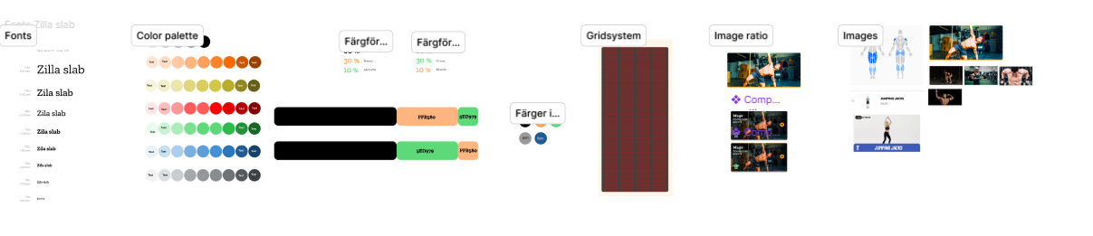
🎨 Visual Identity
I built a visual system around motivation and energy:
- Font: Zilla Slab for strong readability
- Color palette: Contrasting tones for energy, focus, and accessibility
- Grid system: 8-point grid with 4-column layout for consistency
- Design choices: Minimal “visual noise,” clear typography, simple navigation
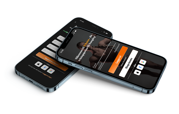
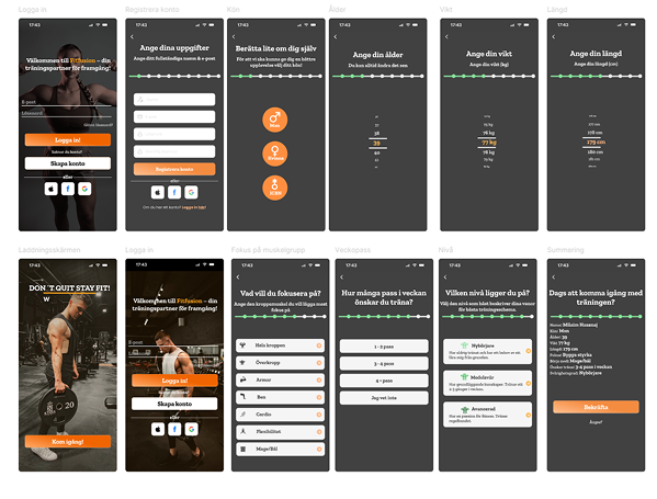
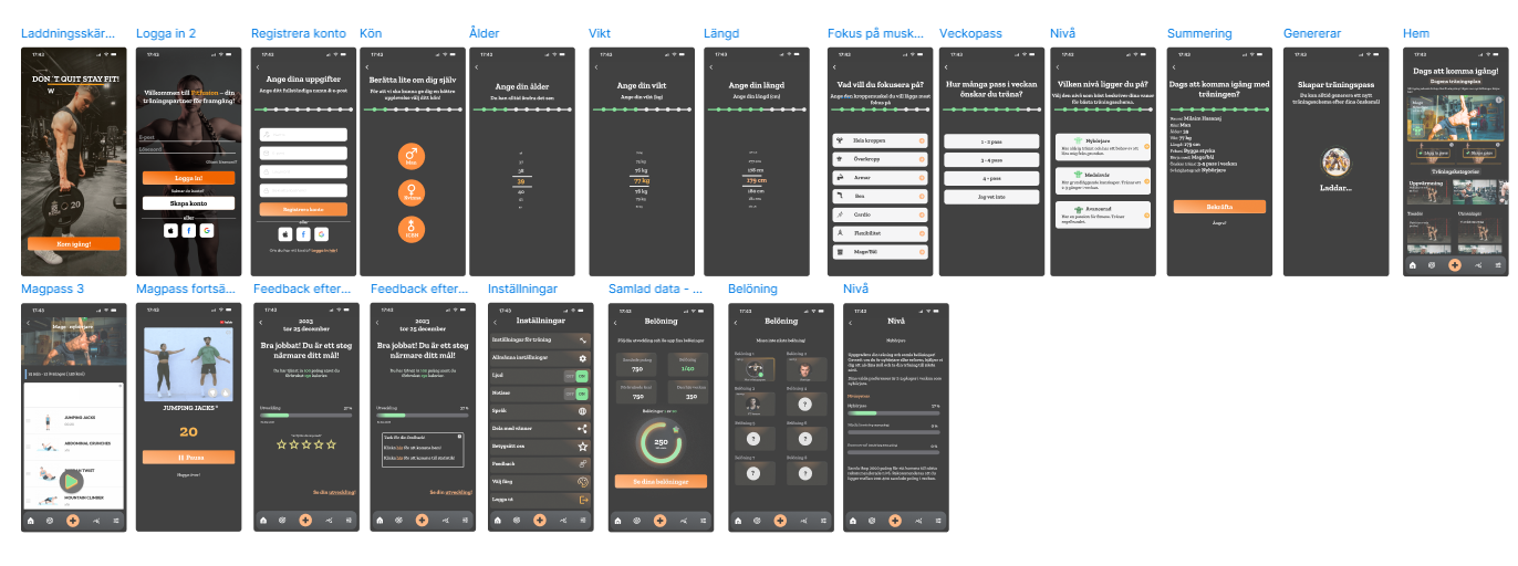
📐 Wireframes
The design process moved from lo-fi sketches to mid-fi wireframes, and then hi-fi mockups:
- Lo-fi: Focused on flow and basic functionality
- Mid-fi: Tested layout and content placement
- Hi-fi: Added brand colors, typography, and motivational design elements
Screens included: login, onboarding, workout plans, stats, and reward system.
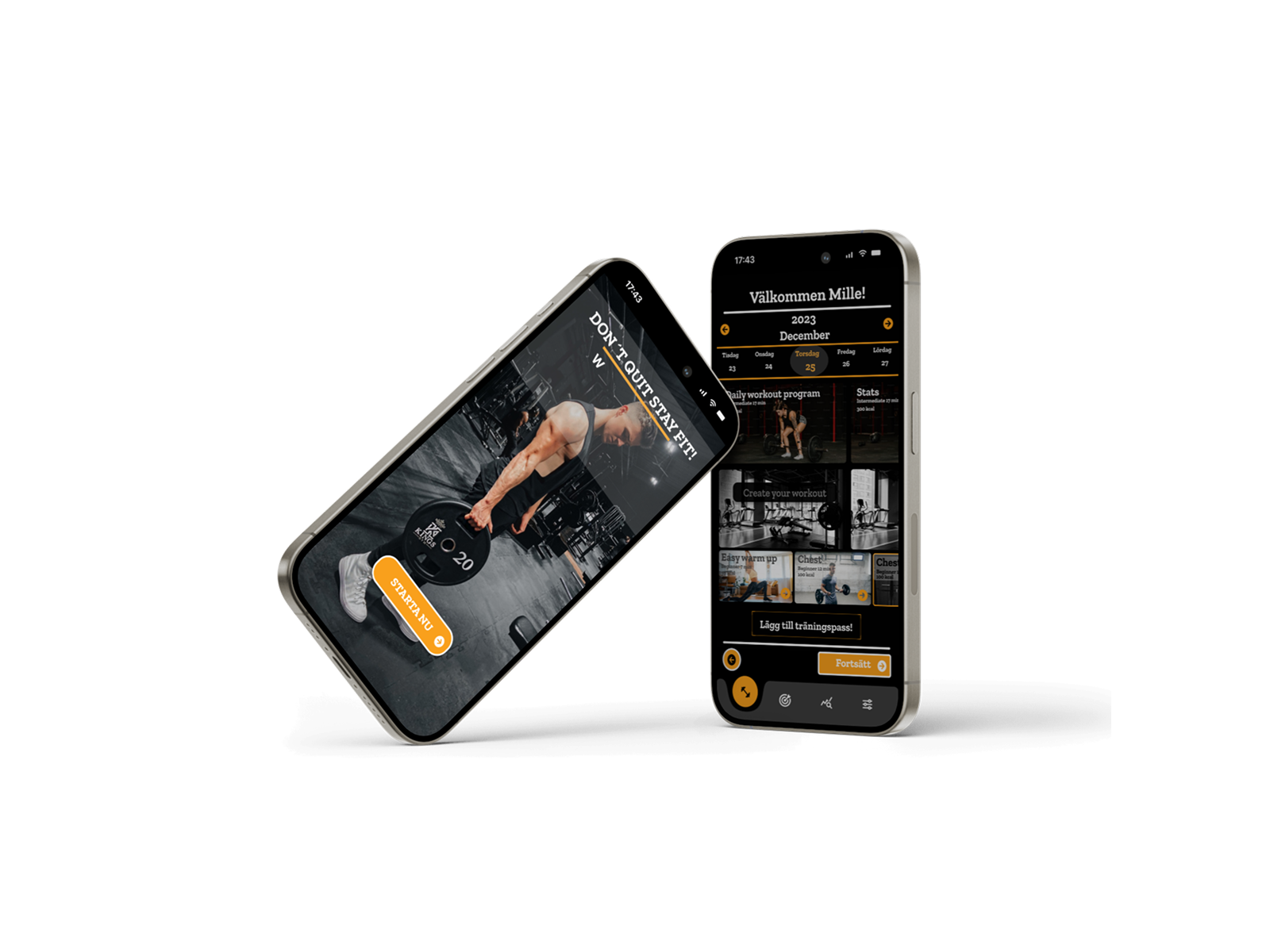
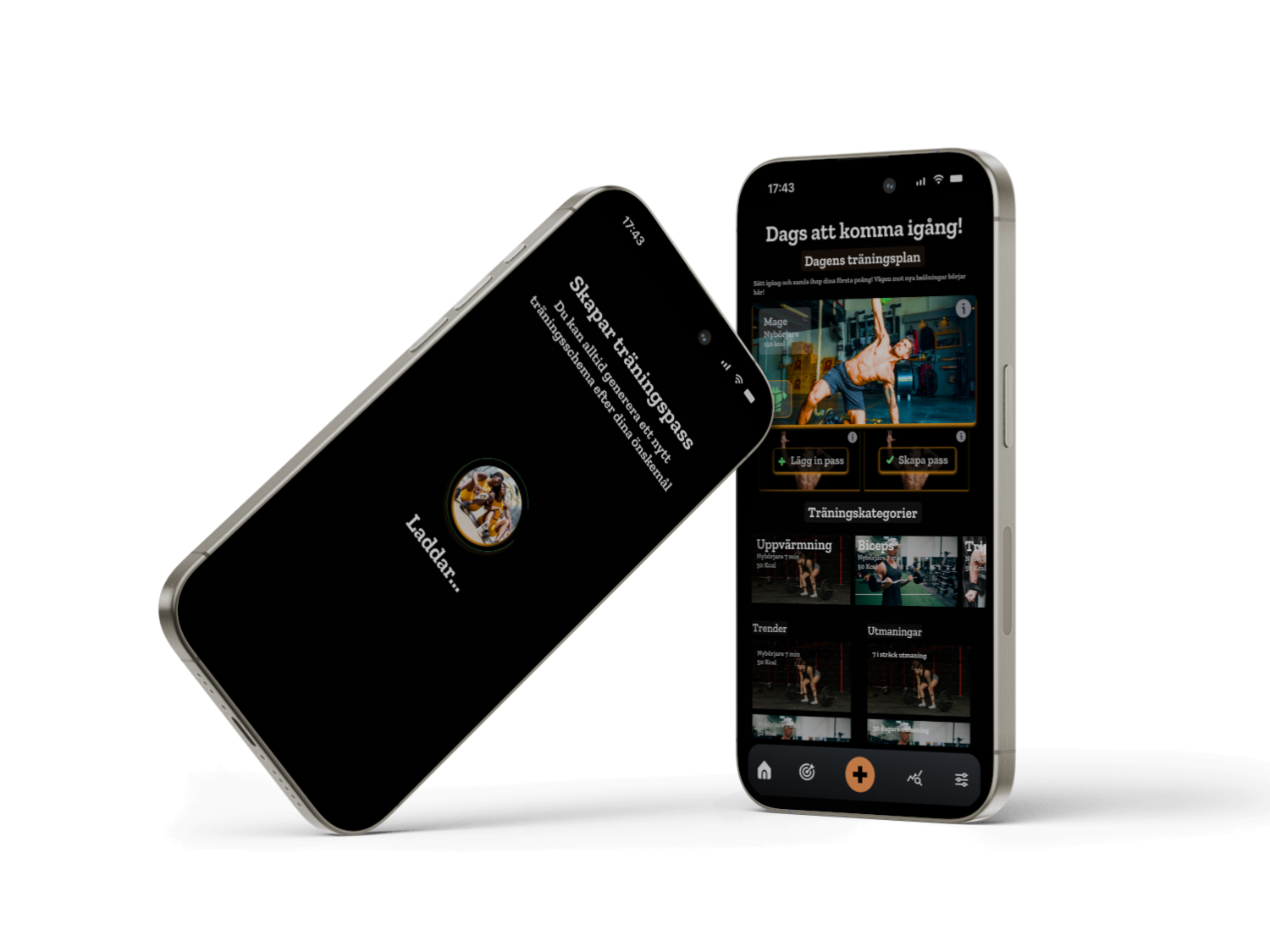
📱 Prototype
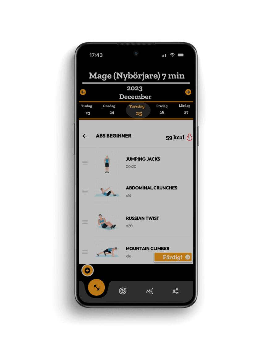
The final prototype was a high-fidelity interactive app created in Figma. Features included:
- Guided workouts (home & gym)
- Equipment instructions
- Reward and challenge system
- Progress statistics with visual feedback
The design ensured both usability and motivation, making the app easy to navigate while encouraging consistency.
📊 Results (KPI)
User testing with prototypes showed promising outcomes:
- ⏱ 30% faster onboarding compared to similar apps
- 🎯 45% reported increased motivation to work out
- 🔎 70% found equipment instructions especially helpful
🤔 Reflections & Learnings
This project taught me how easy it is to jump into high-fidelity design too early. By rushing into details, I overlooked opportunities to explore user needs more deeply during the low- and mid-fidelity stages.
Taking more time in early iterations would have provided stronger insights and led to an even more thoughtful design. Still, the project gave me valuable experience in building a complete product journey – from research to a functional, polished prototype.
Play prototype
Next project Quickbutik
Milaim Hasanaj
Fitfusion
🌍 Project Overview – Journey
💪 Fitfusion – Training Made Simple and Motivating
Fitfusion was developed as part of my Interface Design course in 2023. The goal was to design a fitness app that helps busy professionals build consistent workout habits through short, effective sessions, equipment guidance, and motivational features.
Play prototype
🎯 The Challenge
Many professionals aged 30–45 struggle to stay active due to limited time, lack of gym experience, and low energy after work. Existing fitness apps often provide long sessions or complex training plans, which can be overwhelming.
The challenge was to create a simple, motivating, and beginner-friendly fitness app that fits into users’ busy lives.
👥 Target Audience & Persona
Target audience: Busy professionals, 30–45 years old, looking for accessible fitness solutions.
Persona – Mille Brandon, 36, Marketing Manager
- Background: Lives in Malmö, beginner at fitness, feels low energy after work.
- Goals: Start regular training, learn equipment use, integrate short sessions into his schedule.
- Frustrations: Lack of time, stress, no gym experience.
- Needs: Clear guidance, short workouts, motivational rewards, and social engagement.
🔍 Research & Insights
I analyzed popular apps such as Home Workout, Nordic Wellness, and 24Seven, focusing on how they support beginners.
Key findings:
- ⏱ Users struggle with time and consistency
- 🏋️ They need short, guided workouts
- 🎮 Motivation grows through gamified features
- 👥 Social features like inviting friends increase engagement
These insights shaped Fitfusion’s motto:“Training should be simple, fun, and fit into my busy life.”
🗺 User flow
To map how users interact with Fitfusion, I designed a User Flow for the onboarding process. The flow shows each step new users go through when opening the app – from login or registration, to entering personal details such as age, weight, height, and gender.
By visualizing this flow, I was able to:
- Identify critical decision points (e.g., login vs. register).
- Ensure the onboarding process felt smooth and logical.
- Spot opportunities to reduce friction and avoid unnecessary steps.
This approach helped me design an onboarding experience that balances simplicity with personalization, guiding users into the app with minimal effort while tailoring workouts to their individual needs.
🎨 Visual Identity
I built a visual system around motivation and energy:
- Font: Zilla Slab for strong readability
- Color palette: Contrasting tones for energy, focus, and accessibility
- Grid system: 8-point grid with 4-column layout for consistency
- Design choices: Minimal “visual noise,” clear typography, simple navigation
📐 Wireframes
The design process moved from lo-fi sketches to mid-fi wireframes, and then hi-fi mockups:
- Lo-fi: Focused on flow and basic functionality
- Mid-fi: Tested layout and content placement
- Hi-fi: Added brand colors, typography, and motivational design elements
Screens included: login, onboarding, workout plans, stats, and reward system.
📱 Prototype
The final prototype was a high-fidelity interactive app created in Figma. Features included:
- Guided workouts (home & gym)
- Equipment instructions
- Reward and challenge system
- Progress statistics with visual feedback
The design ensured both usability and motivation, making the app easy to navigate while encouraging consistency.
📊 Results (KPI)
User testing with prototypes showed promising outcomes:
- ⏱ 30% faster onboarding compared to similar apps
- 🎯 45% reported increased motivation to work out
- 🔎 70% found equipment instructions especially helpful
🤔 Reflections & Learnings
This project taught me how easy it is to jump into high-fidelity design too early. By rushing into details, I overlooked opportunities to explore user needs more deeply during the low- and mid-fidelity stages.
Taking more time in early iterations would have provided stronger insights and led to an even more thoughtful design. Still, the project gave me valuable experience in building a complete product journey – from research to a functional, polished prototype.
Play prototype
Next project Quickbutik