Quickbutik
💡 Designing Clarity: A Seamless Onboarding for Quickbutik
Mission
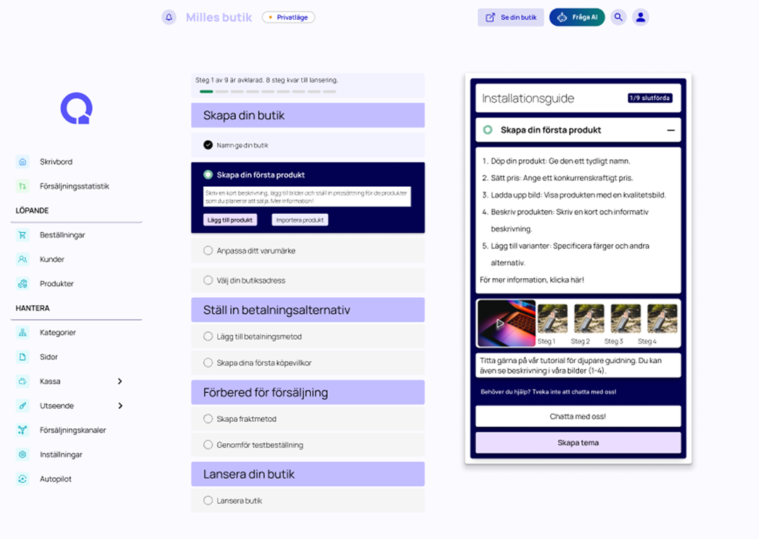
The goal was to redesign the onboarding flow for Quickbutik, a Swedish e-commerce platform, to reduce drop-offs during payment and shipping setup. The mission was to create a simpler, clearer, and more motivating journey from registration to store launch.
Process
I applied a user-centered design approach:
- Identified key pain points through competitor analysis and surveys
- Created personas to understand user needs
- Designed a new user flow to reduce friction points
- Iterated with lo-fi and mid-fi prototypes
- Conducted feedback rounds to refine usability and clarity
Result
The final prototype included:
- A visual progress bar to guide users
- Split onboarding steps for easier navigation
- Contextual help and inline guidance
- Simplified payment and shipping setup This led to a smoother onboarding process, reducing complexity and improving motivation to complete setup.
Reflection
What I learned
This project taught me the importance of balancing simplicity with flexibility in onboarding design. Small details like progress indicators and contextual help can have a big impact on reducing user frustration. I also learned how to transform real user feedback into actionable design improvements.
Play prototype
Explore the process