Parkster AB
Redesign of the Help & Support flow to make support clearer, faster, and more accessible for users.
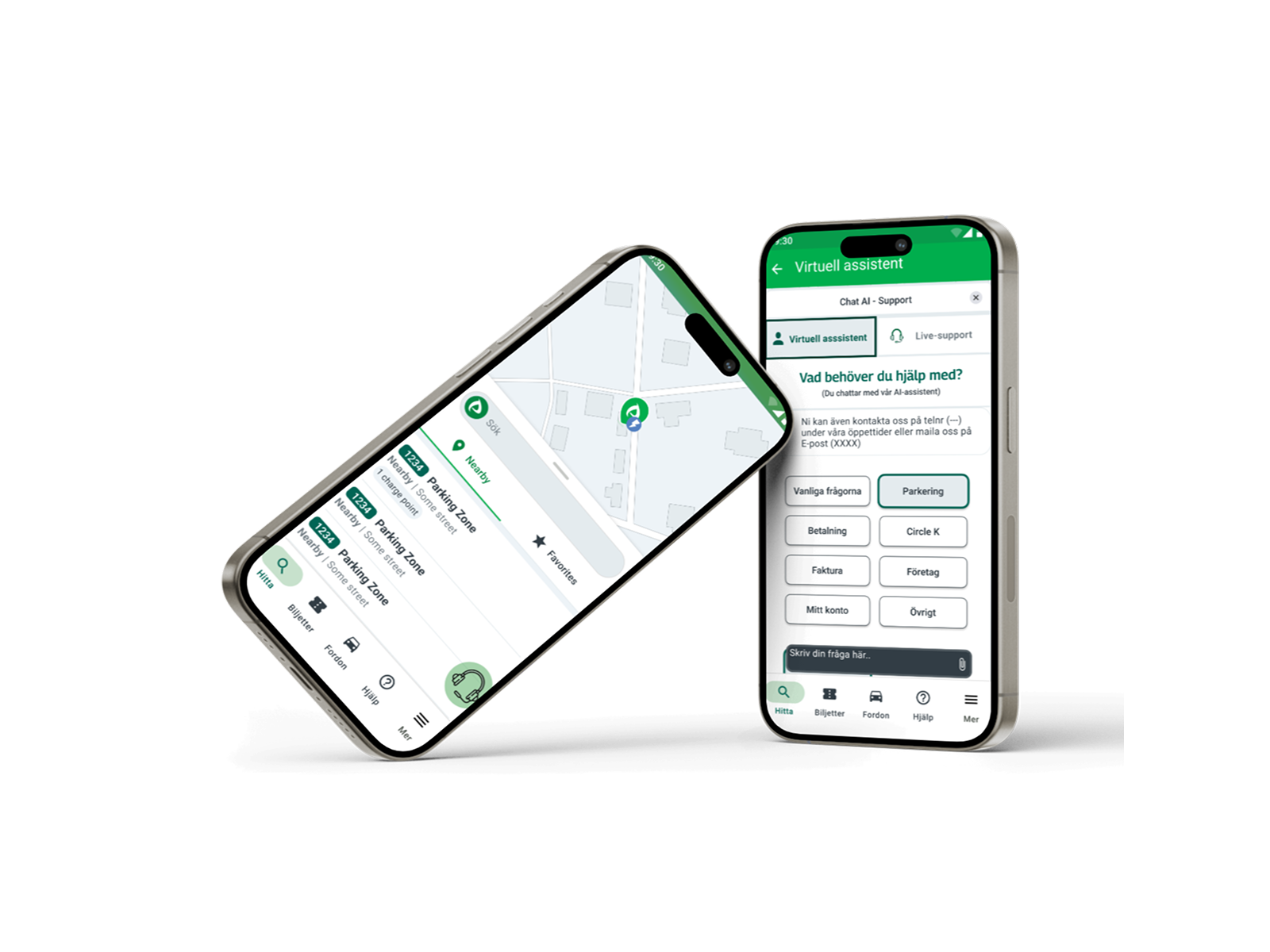
The project focused on simplifying navigation, improving taxonomy, and integrating an AI-powered chatbot to guide users more effectively.
Users struggled to find the right support in Parkster’s app — the help section felt hidden, unclear, and hard to navigate.
As part of our redesign, we introduced a more structured help flow: clearer taxonomy, a dedicated support icon, and an AI-powered chatbot combined with live support. The result was a more intuitive and accessible experience, helping users get the right answers faster.
💡 Creating clarity with taxonomy, choreography, and a chatbot.
Collaborating with Parkster, we improved the support experience by applying principles from information architecture—such as taxonomy, choreography, and language use—while designing a more accessible, user-centered help section with a chatbot, Q&A, and clear navigation.
Reflection
What I learned
Achievements
This project gave me hands-on experience applying information architecture principles to a real-world app scenario. I successfully designed a more structured help flow that combined taxonomy, a dedicated support icon, and chatbot integration — resulting in clearer and more accessible user journeys.
Learnings
I learned how even small changes in wording, categorization, and hierarchy can make a big difference in usability. Iterating quickly with low-fidelity sketches before moving into hi-fi prototypes taught me the value of testing ideas early and often. I also deepened my understanding of user-centered design by focusing on both “known item seekers” and “exploratory seekers.”
Next Steps
If I were to continue developing this concept, I would run usability tests with real Parkster users to validate the redesigned self-service flow. I would also explore ways to integrate inclusivity and 24/7 support features to ensure that the solution meets the needs of a broader user base.View prototype
Explore the process