Read It
💡 Inclusive reading design for children with dyslexia
A mobile reading app concept tailored for children with dyslexia. The project was developed during a UX design sprint with a focus on inclusive design, accessibility, and joyful learning.
🛑 The Problem
Children with dyslexia often struggle with digital reading platforms that are cluttered, text-heavy, or lack proper accessibility features. Existing apps didn’t motivate or support joyful reading, leading to frustration and disengagement.
🚀 The Process
As part of a five days design sprint, we:
- Defined our sprint goal based on UN Global Goals.
- Conducted user research and created personas to capture needs and pain points.
- Used ideation methods such as Lightning Demos, Crazy 8s, and sketching.
- Designed and tested lo-fi to hi-fi prototypes, iterating based on feedback.
- Applied inclusive design principles like text-to-speech, simplified navigation, and gamification elements.
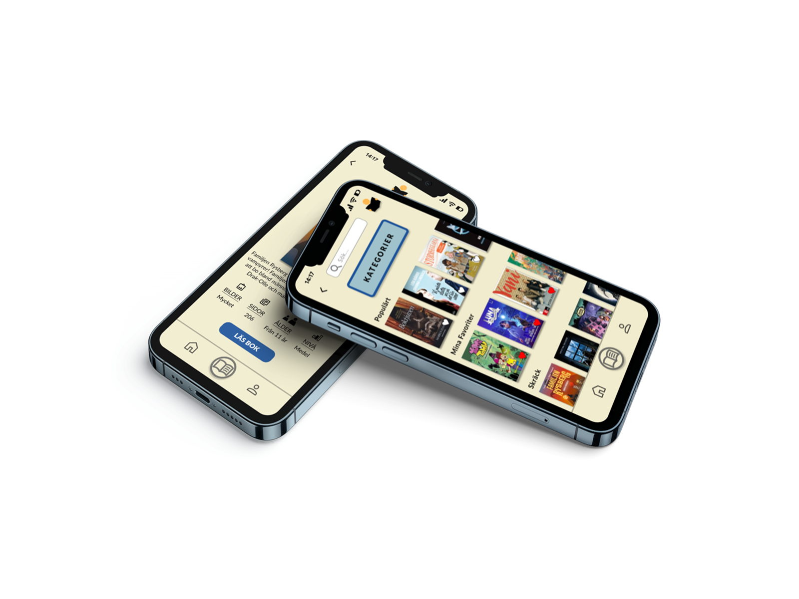
✅ The Result
The final concept was a playful, accessible mobile reading app with:
- Text-to-speech to support children struggling with reading.
- Gamified progress & visuals to increase motivation.
- Simple and clear navigation to reduce cognitive load.
- Positive feedback from user testing, confirming that the design supported both joyful reading and accessibility needs.
Reflection
What I learned
I gained valuable insights into designing for accessibility, especially for children with dyslexia. Small details in wording, navigation, and visual hierarchy had a big impact on usability.
I learned the importance of inclusive design principles, making sure the product works not only functionally but also feels engaging and motivating.
I experienced the value of rapid prototyping – moving quickly from lo-fi sketches to hi-fi designs allowed us to validate ideas without overinvesting too early.
Collaborating in a design sprint setting showed me how effective structured ideation methods (Lightning Demos, Crazy 8s) can be to generate creative, user-centered solutions.
Future directionsIf I were to continue developing Read It, I would:
- Conduct usability tests with real children and educators to validate and refine the concept.
- Explore adaptive learning features – tailoring reading support to different levels of dyslexia.
- Add community elements to foster peer encouragement and shared reading experiences.
Play prototype
Explore the process